Photo Illustration Diptych Guide
How to Pair a Real City Photo With a Gouache Skyline in a Vertical Diptych
This step-by-step walkthrough shows how to arrange a real city night scene and its softer gouache reimagining in a single vertical diptych, so you can keep a clear reference panel alongside a stylized creative version without manual layout work.
Fast Answer
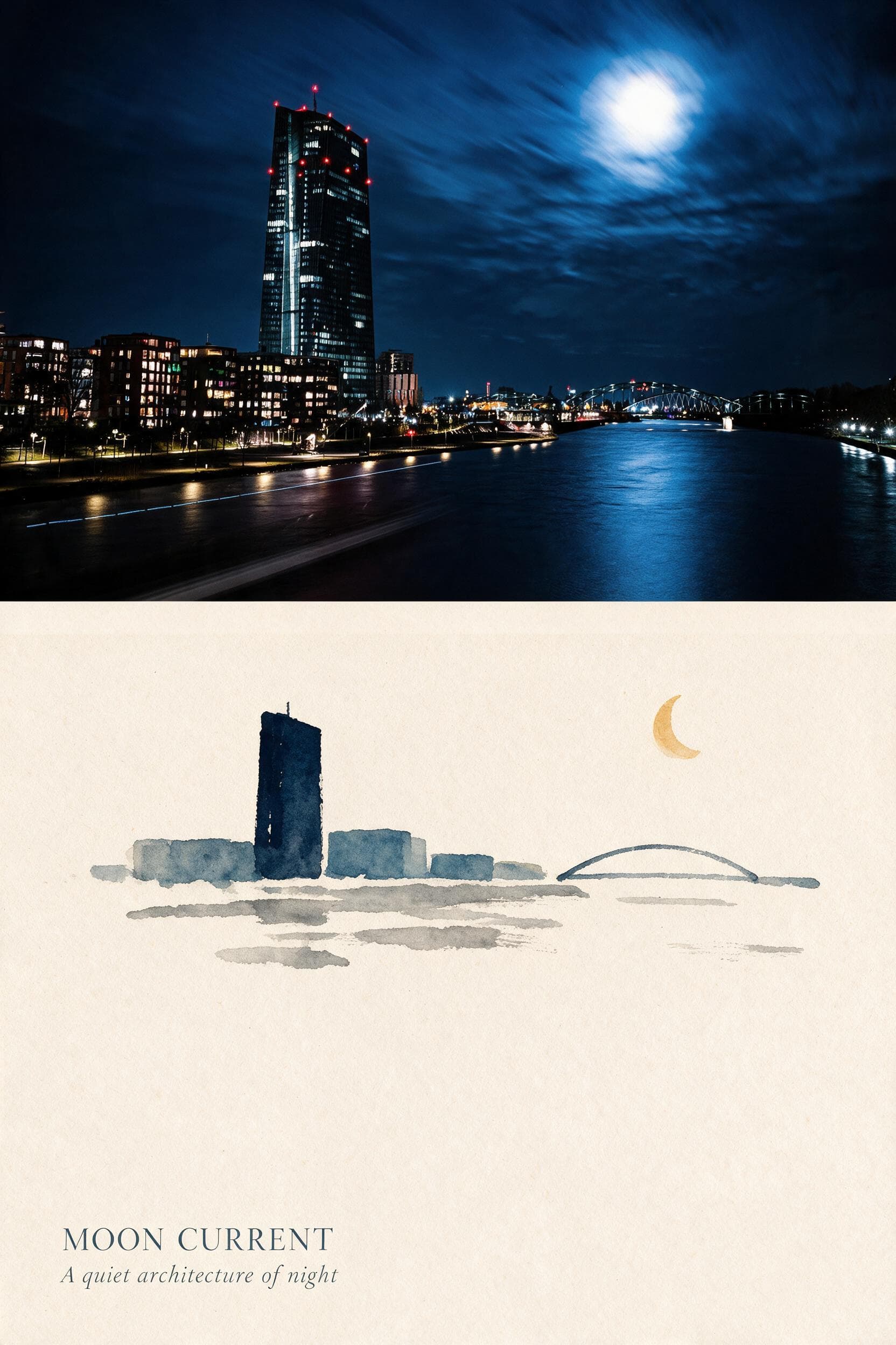
This guide walks you through using the Photo Illustration Diptych Skill to turn your city skyline photo into a vertical two-panel layout, with a photographic upper section and a simplified gouache lower section that repeats the same core visual rhythm.
What We Observed in the Published Sample
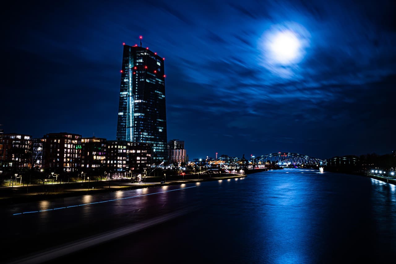
The reviewed sample source is a blue night river scene with a tall illuminated tower on the left, a low arched bridge on the right, and a bright moon above the water. The corresponding result displays a continuous photographic crop across the upper half of the vertical frame, showing the tower, bridge, moon, shoreline, and river. The lower half repeats these elements in the same relative order, rendered as sparse blue-gray gouache shapes. Fine details including individual windows, rippled river reflections, and soft cloud edges that are visible in the upper photographic section are simplified in the illustrated lower panel. A generated title and subtitle appear at the very bottom of the result, and the exact wording of this text may not match your intended phrasing.
Step-by-Step Workflow
- 01
Open the Published Skill
Open the public Photo Illustration Diptych Skill at /skills/photo-illustration-diptych. Review its published source-and-result pair first, paying attention to the vertical split, the photographic upper area, the gouache interpretation below, and the generated title at the bottom.
- 02
Upload Your Source City Photograph
Provide your own real city photograph that contains the core elements you want to carry through to the final diptych. For best results, choose a scene with distinct, spaced landmarks such as a tower, bridge, and prominent sky feature like a moon, so the relative rhythm of the composition stays clear across both panels. You can use a night river skyline similar to the sample, or any other outdoor scene where you want to pair a faithful photographic reference with a quieter illustrated interpretation.
- 03
Run the Transformation and Review Your Output
Initiate the generative transformation and wait for the Skill to deliver your completed vertical diptych. Once the result loads, compare it side by side with your original source photo to confirm the arrangement matches your expectation. If the output aligns with what you wanted, save it to your signed-in Imagild Library for the platform's stated retention period so you can access it later for sharing or further review.
Key Decisions to Make Before You Start
- Choose Which Visual Rhythm to Preserve
- Before you select your source photo, decide which core elements must appear in the same relative order across both panels of the diptych. In the published sample, the tower sits on the left, the bridge on the right, and the moon above the river, and this arrangement carries through to the gouache lower section. If your photo uses a different landmark layout, confirm you are comfortable that the generative process will attempt to honor that same spatial rhythm rather than rearranging elements arbitrarily.
- Decide Which Details You Are Comfortable Seeing Simplified
- The illustrated lower panel does not retain every fine detail from your original photo. Individual window lights, sharp river reflections, and delicate cloud shapes that are clearly visible in the photographic section will be reduced to broader, softer gouache shapes. If you need a specific fine detail to remain fully legible in the lower panel, you may want to test the Skill with a smaller crop first to see how that detail is handled before processing your full preferred image.
- Plan to Review All Generated Text for Exact Wording
- The published sample includes a generated title and subtitle at the bottom of the diptych, and this automatically produced text may not use the exact phrasing, spelling, or meaning you intend. If you are creating this diptych for professional sharing, social media publication, or any use case where exact lettering matters, you must inspect the final output text carefully before you export or share the file. Imagild does not guarantee the accuracy of any generated text, so this verification step is your responsibility.
Official sources checked
Frequently Asked Questions
Can I use this Skill with a daytime city photo instead of a blue night river scene?
Yes, you can upload any source photograph that has a clear set of spaced, distinct landmarks to test with the Skill. The published sample uses a blue night river scene, but the workflow is not restricted to that exact subject matter. Keep in mind that the resulting gouache panel will adapt to the color palette and composition of your source image, so a daytime scene will produce different tones and shapes than the blue-gray gouache seen in the documented before-and-after pair.
What should I do if the upper photographic section of my result does not look like my original source?
If the upper panel of your output differs noticeably from the photo you uploaded, compare the two images directly to identify which elements have shifted. You can return to the Skill page and re-upload your original source file to run the transformation again. Because this is a generative Skill and not a deterministic filter, individual runs can produce slightly different results, and no two outputs will be perfectly identical. There is no guarantee that every run will preserve the exact photographic crop you expect.
Where can I find other related Skills that create stylized illustrated versions of my photos?
After you have explored the Photo Illustration Diptych Skill, you can visit two related guides published on Imagild: the photo-to-diptych guide for additional two-panel layout ideas, and the photo-to-watercolor-illustration guide if you want to explore single-panel illustrated styles that use different traditional medium aesthetics. Both guides are designed for the same audience of casual photo owners and independent creators who want repeatable, easy-to-use visual directions without complex editing software.