Vintage Travel Log Page
Reduces a photographed place to a square Japanese travel-log page printed with four restrained inks.
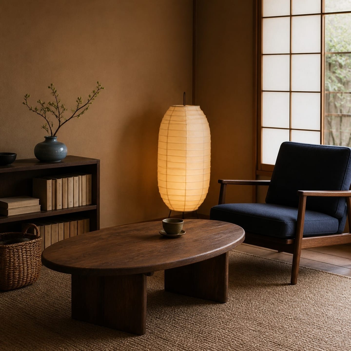
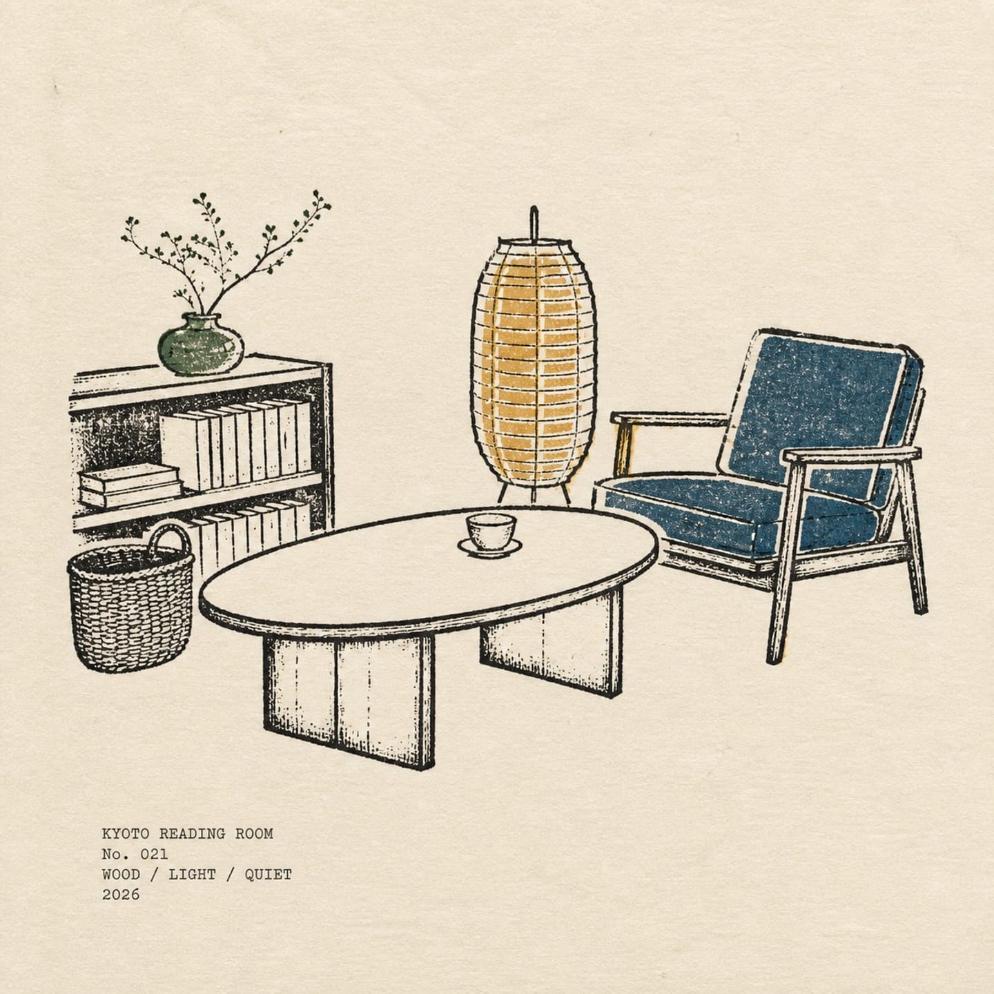
Reduces a photographed place to a square Japanese travel-log page printed with four restrained inks.
Photo Skill documented with a real comparison
Reduces a photographed place to a square Japanese travel-log page printed with four restrained inks. Vintage Travel Log Page is a reusable transformation method rather than a fixed color filter. It reads the people, objects, pose, spatial relationships, and dominant visual cues that are actually present in the uploaded photograph, then rebuilds the presentation around that evidence. The input and output shown above are the most direct proof of what the current published version does.
The method currently sits around Travel Log, Screenprint, Editorial. A different source photograph will not produce an identical layout, because the system must respond to that image's subject, aspect ratio, light, and background. The central identity, meaningful pose, and important object relationships should nevertheless remain recognizable. Use the visible comparison to decide whether this method is a good match before you upload personal material.
A person, animal, building, or object with a clear silhouette gives the transformation reliable identity anchors. If the subject is already tiny, blurred, or hidden, stylization cannot safely recover missing visual evidence.
Hands, held objects, furniture, companions, and horizon lines should be separated clearly enough to understand. This helps the result preserve the event in the photograph instead of treating every shape as decoration.
The source does not need to resemble the finished artwork, but it should have enough resolution and breathing room for Vintage Travel Log Page to reorganize color, surface, and composition without losing the main subject.
Use the camera file when possible. Avoid screenshots containing app interfaces, heavy existing filters, large obstructions, or repeated compression, because those artifacts can be interpreted as part of the scene.
The creator's optional guidance is: Enter: LOCATION | KEYWORD / KEYWORD / KEYWORD. Example: KYOTO READING ROOM | WOOD / LIGHT / QUIET. Keep the location and keywords in the exact language you want printed. Treat it as clarification, not a request to replace what is visibly present.
Check the face, pose, object count, contact relationships, and overall composition first. Then evaluate palette and texture. If essential content is wrong, retry with a clearer source rather than attempting to repair missing evidence with a long prompt.
Reduces a photographed place to a square Japanese travel-log page printed with four restrained inks. It primarily changes the visual presentation while the central subject and meaningful relationships should remain identifiable.
No. Add one only when the photograph cannot communicate a required place, accessory, color, or short wording. The current creator guidance is: Enter: LOCATION | KEYWORD / KEYWORD / KEYWORD. Example: KYOTO READING ROOM | WOOD / LIGHT / QUIET. Keep the location and keywords in the exact language you want printed.
No. The comparison shows the method, composition tendency, and expected quality range. Your result is rebuilt from your own subject, aspect ratio, lighting, and background.