Halftone Portrait Guide
Turn a High-Contrast Portrait Into a Limited-Color Halftone Print With Halftone Bloom
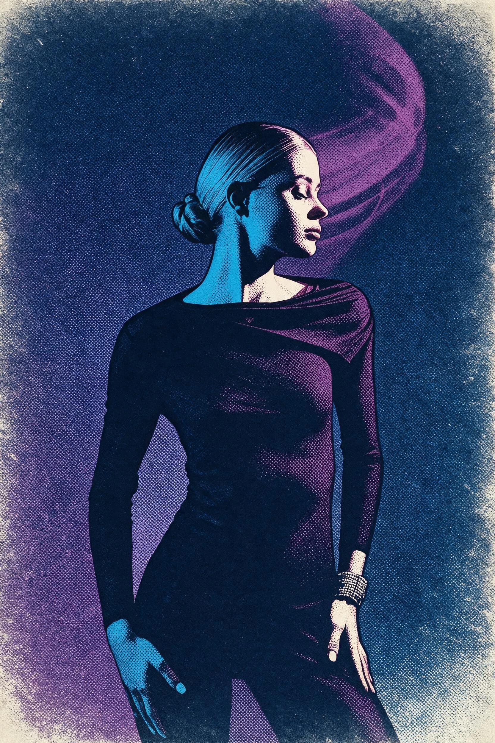
This guide uses one reviewed Halftone Bloom source/result pair to explain what changed on the surface and which portrait details remained comparable. It also gives you a practical checklist for rejecting a result when the profile, pose, hands, clothing silhouette, crop, or source text no longer reads clearly.
Quick Answer
Open Halftone Bloom, provide a portrait, run the generative transformation, and compare the result with the source before saving it. The reviewed example uses one high-contrast profile portrait and produces cyan-magenta dots, registration drift, and distressed edges. Those are observations about this sample, not a promise that another photo will keep the same colors or details.
Reviewed Source and Result Pair
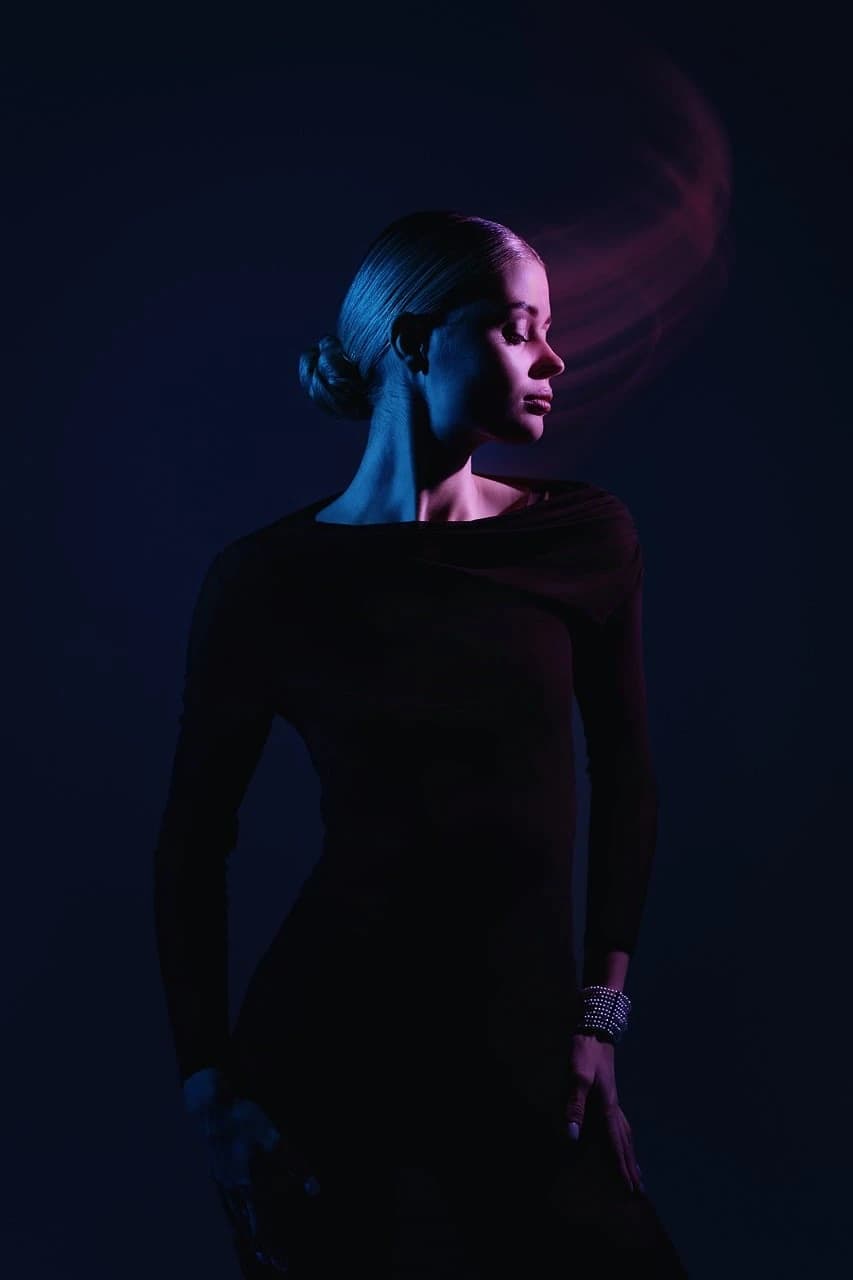
The source is a vertical studio portrait of one adult subject in profile, wearing a dark long-sleeve outfit against a near-black background with cyan and magenta light. In the reviewed result, the single subject, bun, shoulder line, sleeves, hand positions, bracelet, dark crop, and curved magenta background form are still visible in comparable positions. Smooth tonal areas become coarse dots, with cyan-magenta separation, slight registration drift, and distressed edges resembling worn paper. This reviewed output is generated raster artwork. It is not separated printing plates, vector artwork, a press-ready screen-print file, or proof of a physical printing process.
Simple Workflow Steps
- 01
Open Custom Studio and upload the portrait
Describe visible halftone dots, a restrained cyan–magenta palette, slight print-registration offset, and worn paper edges. Keep the source available for a side-by-side check; the result is raster artwork, not a print-production separation file.
- 02
Provide your high-contrast profile portrait
Provide the portrait you want to transform and run the Skill. Keep the source photo available for the later comparison. The reviewed source has a clear profile, dark clothing, visible hands, and separated cyan-magenta lighting; those are sample characteristics, not mandatory input rules and not evidence that contrast controls the quality of another generation.
- 03
Run the transformation and review your output
When the result is ready, compare it with the original. Check the profile outline, pose, hand positions, accessories, clothing silhouette, crop, and any source text that matters. Keep only a result you accept. Reject a version when a critical detail changes or disappears rather than describing it as preserved.
Key Creative Decisions to Make Before You Start
- Choose which core details you want to keep legible
- Before running the Skill, list the source details that matter for your intended use. In the reviewed pair, useful comparison points include the facial outline, bun, shoulder curve, hands, bracelet, and clothing silhouette. Your portrait may require different checkpoints. This list makes the review reproducible without implying that the transformation will preserve every chosen detail.
- Understand what the Skill deliberately reinterprets rather than copies exactly
- In the reviewed pair, smooth gradients become visible dots, the colors narrow to cyan and magenta, the layers show slight registration drift, and the edges resemble distressed paper. Treat these as observed changes in this example. Your result may arrange dots, colors, edges, and fine facial detail differently, so judge the generated image itself instead of assuming the sample defines a fixed output.
- Verify print suitability independently before production
- A generated raster artwork can resemble a classic halftone print without being ready for physical production. If you intend to print the result, do not infer production readiness from its appearance; ask your chosen print provider for the requirements that apply to your project.
Official sources checked
Frequently Asked Questions
Will Halftone Bloom turn any photo into a good-looking limited-color halftone?
This guide evaluates only one high-contrast studio profile pair. It does not establish compatibility or quality for full-body shots, group photos, food, pets, landscapes, or other subject classes. With any different source, check subject count, pose, geometry, hands, small objects, text, and crop in the actual result before accepting it.
Is the file I get from Halftone Bloom a real press-ready halftone that I can use to make screen-print separations?
No. The reviewed output is a generated raster artwork, not separated color plates, an editable production file, or evidence that a physical printing process occurred. Its halftone appearance does not establish production readiness. Ask your chosen print provider which requirements apply before using any generated image in physical production.
How is Halftone Bloom different from a basic pixelation effect or a generic comic book filter?
Adobe describes halftone as a dot-based way to evoke older color printing. In Imagild’s reviewed pair, the result shows varying dots, cyan-magenta color, registration drift, and distressed edges rather than square pixel blocks. This comparison describes the visible sample only; it does not disclose an internal algorithm or promise the same surface on another generation.