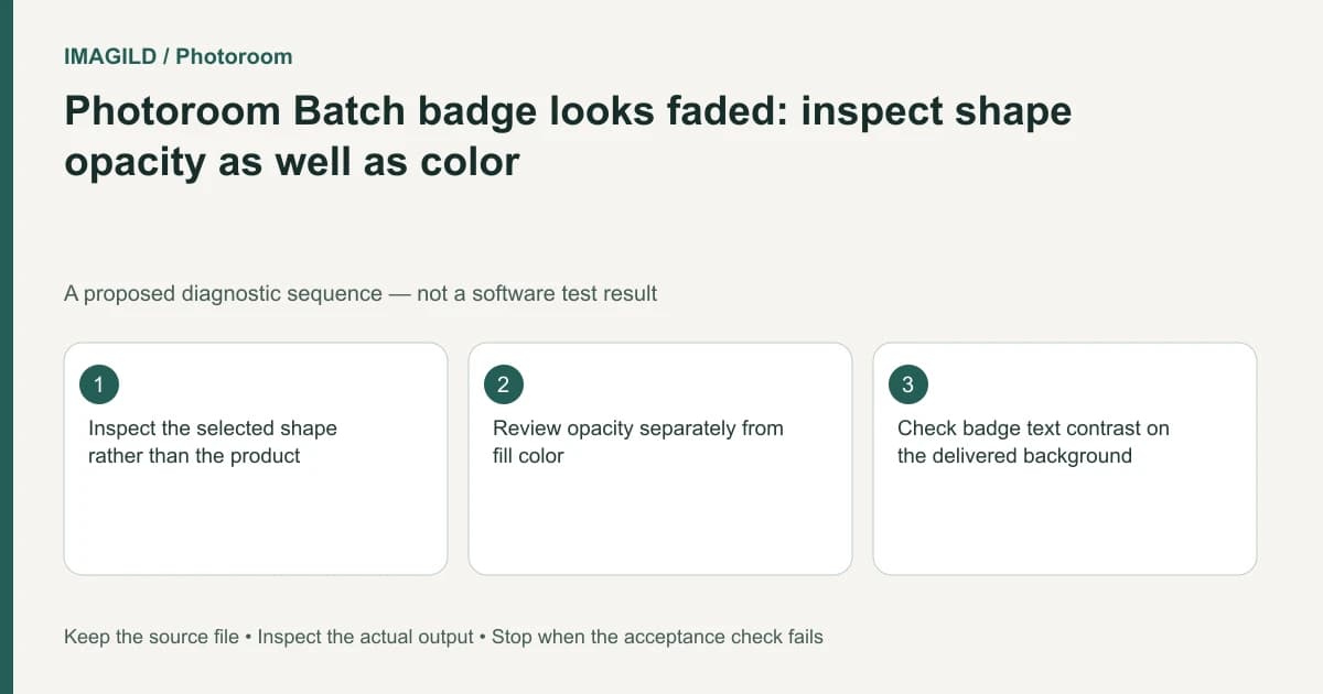
Select the badge's actual shape layer and inspect its opacity as well as its fill color. Photoroom Batch Web exposes display adjustments that can make the same chosen color appear faded. Preserve the design, change one property at a time, and check text contrast against the real background before approving the export.
Identify the shape rather than the product
A sale badge may contain a shape, a text layer, an outline and a shadow. Clicking its text does not establish that you are changing the shape beneath it. Record the selected layer and identify which component actually looks faded.
Photoroom's shape-editing guide lists opacity among the shape's display adjustments. A correct fill choice can coexist with a different opacity or another adjustment. Repeatedly selecting the same color may therefore leave the underlying issue untouched.
Preserve the current design so accepted positioning and wording are recoverable. Do not brighten the whole product image simply to make one badge stronger. That would alter a different part of the composition.
Separate stored color from composited appearance
A partly transparent shape is judged together with whatever is behind it. The same badge can appear different over a light wall, a dark product or a textured scene. Inspect the actual intended background rather than comparing only the color picker.
The MDN opacity reference explains the general concept of transparency in compositing. It is not documentation of Photoroom's internal implementation or a promise about a specific exported pixel value. Use the application's displayed settings and the actual file to establish what your design does.
If the brief includes a brand color, keep that approved value in the production record. A visual correction should not silently substitute another color to compensate for a forgotten transparency setting. Decide whether the design requires an opaque badge or an intentionally translucent one.
Inspect one property at a time
| Observation | Property or relationship to inspect | Acceptance question |
|---|---|---|
| Background shows through the badge | Shape opacity and source transparency | Is transparency intentional? |
| Hue differs from the approved design | Fill and other display adjustments | Is the approved color represented appropriately? |
| Badge edge looks soft | Blur and actual output size | Is the boundary still readable? |
| Text looks weak but shape is solid | Text styling and text opacity | Are the words legible? |
| Shape seems faint behind the product | Layer placement and occlusion | Is it supposed to sit in front? |
| Export differs from preview | Delivered file and viewer background | Which artifact is actually approved? |
This table is an editorial diagnostic plan. It does not calculate color accuracy or certify accessibility. If the project has a measured color or contrast requirement, use an appropriate verification method and record its actual result separately.
Keep the product reference unchanged
Review the badge without letting it conceal meaningful product content. The product-label preservation guide explains why packaging text and identity details deserve their own check. A prominent promotion should not cover a feature the buyer needs to inspect.
If the product becomes harder to distinguish after a badge change, inspect figure-ground separation. Our white-product-on-white-background guide addresses that broader presentation issue. Fixing a badge does not require altering the actual product color.
When a factual product source must remain intact, use the source-preserving composite workflow. Keep graphic decoration and the protected product as separately understood roles.
A hypothetical pale promotion badge
Suppose a shop chooses its approved red for a rectangular offer badge, but it appears pale over a white studio background. The editor keeps reselecting the red swatch. This is a proposed diagnostic example, not a tested Photoroom session.
Identify the shape layer and inspect its display settings. If transparency is unintended, correct that property deliberately, then review the text and the badge against each relevant product image. A correction acceptable over one background may be too dominant over another.
Keep a comparison showing the accepted appearance and its intended context. Do not call it a measured brand-color match unless a real color check was performed with a stated method.
Reopen the actual output
The MDN image-format guide helps distinguish file formats and transparency capabilities. Inspect the downloaded image in the destination context; a transparent asset can look different when another background is supplied later.
Check the badge words, edges and product details at actual display size. Retain the editable design and the accepted export. This documentation-based guide reports no app execution, sampled color values or measured opacity result.