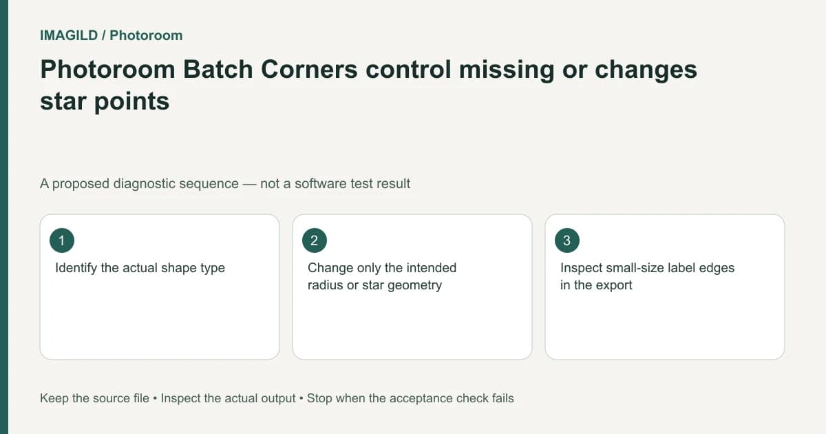
Identify the native shape before looking for a Corners setting in Photoroom Batch Web. The control is conditional: a rectangle's corner radius and a star's points or inner depth describe different geometry. Preserve a source copy, edit the intended shape, and check its outline together with the badge text at delivery size.
Determine whether the object is actually a shape
A circle, a native star and an uploaded picture of a star can look similar in a thumbnail while offering different controls. Record the selected layer type. Do not assume a raster badge becomes editable geometry because its edges look crisp.
The Photoroom Corners documentation describes shape-dependent settings. If the selected object has no applicable corners, the absence of a radius control can be correct behavior rather than a selection failure.
Preserve the existing design and note the intended geometry. A request for a softer rectangle is different from a request for more star points. Writing that requirement makes it easier to inspect the result without repeatedly adjusting unrelated controls.
Choose a geometry criterion before moving sliders
For a rectangular badge, ask whether the corners should be subtly softened or form a pill-like outline. For a starburst, decide how many tips are intended and how deep the inner notches should appear. Keep the text area and border thickness in view while making those decisions.
Do not describe these settings as interchangeable measures. Increasing a star's point count changes its silhouette; it does not simply round the same shape. A circle does not become a rounded rectangle by searching for the same menu item.
The general shape-editing guide places corner editing alongside color, outline and other properties. Change one property first so a visual improvement can be attributed to the correct operation.
Use a shape-specific acceptance table
| Selected object | Appropriate question | Acceptance check |
|---|---|---|
| Native rectangle | How rounded should its corners be? | Consistent radius and enough text space |
| Native star | How many tips should the badge have? | Intended silhouette remains readable |
| Star with deep notches | Is its center large enough for the copy? | Text stays inside the useful center |
| Circle | Is a different shape actually required? | No search for inapplicable corners |
| Uploaded badge image | Is native geometry needed? | Representation is identified honestly |
| Badge plus text | Do both parts still fit together? | No clipped letters or crowded border |
The table is a design-review proposal, not a claim that every object exposes every listed control. Use the current Web Batch interface and its official help for the selected type.
Keep a comparison without accumulating duplicates
If you duplicate a layer to compare alternatives, follow Photoroom's duplicate-layer workflow. Identify each candidate because copies may overlap. Move a working candidate into a clear comparison position and retain the approved one explicitly.
Avoid exporting both candidates accidentally. A slightly offset duplicate can thicken an edge or make the badge look blurred. Once a choice is accepted, remove or otherwise exclude the unwanted candidate through the supported workflow and inspect the final composition again.
If a shape has already been exported as an SVG or image, do not infer its original structure from appearance alone. Our vector-looking artwork versus cut paths guide explains that broader representation issue. The SVG stroke-as-fill guide addresses another reason imported outlines may not behave like their original controls.
A hypothetical discount badge
Suppose a shop needs a starburst containing a two-line offer. Adding more points makes the badge decorative, but deeper notches crowd the words. This is an illustrative design plan, not a tested Photoroom session.
Keep the wording fixed while comparing star geometry. Inspect whether the center remains large enough, whether the outline approaches any letters and whether the badge is still understandable at the final product-card size. If it fails, revise the geometry or approved wording rather than shrinking essential text indefinitely.
For a rounded rectangle alternative, evaluate radius as a separate design decision. Do not claim that the rectangle and star are the same shape with different settings; the comparison is between two layouts serving the same message.
Verify the accepted artifact
Reopen the downloaded image and inspect corners, outline continuity and small text. Retain the editable master separately from the flat output, particularly if future promotions will reuse the badge with longer text.
Record the accepted shape and revision in plain language. This documentation-based guide reports no application test, geometric measurement or claim that one badge construction is universally optimal.